Colour Words in Your Negative Prompt Are Why Your Images Are Oversaturated
Classifier-free guidance pushes away from the negative prompt, so "grey, washed out, pale" is an instruction to oversaturate. Measured across eight scenes: removing three colour words moved highlight saturation from 0.74 to 0.40 after lowering CFG had changed nothing.
TL;DR — If your CFG-guided image model produces images that are too saturated, look at your negative prompt before you touch the guidance slider. Classifier-free guidance pushes away from the negative, so words like
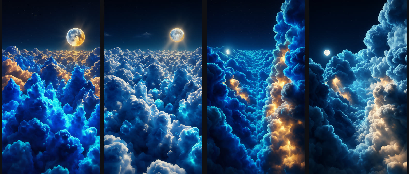
grey, washed out, paleare colour instructions with the sign flipped. Removing three words from a negative prompt moved measured highlight saturation from 0.74 to 0.40 and landed the whole image on the reference profile — after two other hypotheses, including turning CFG down, had changed nothing.
This came out of a boring problem: matching the colour of a reference image well enough that the difference is a number rather than an argument. The finding is not specific to the model used here. It applies anywhere classifier-free guidance and a negative prompt are both in play.
How colour was measured
Everything below is a measurement, so the definitions come first. Each image is resized to 360 px on its long edge, converted to HSV, and split into three bands by value (V):
| Band | Definition | What it describes |
|---|---|---|
| Shadow saturation | mean S where V < 0.35 | how coloured the dark areas are |
| Mid-tone saturation | mean S where 0.35 ≤ V ≤ 0.7 | the colour of the subject's body |
| Highlight saturation | mean S where V > 0.7 | how coloured the lit faces are |
| Warm ratio | share of highlight pixels in the warm hue range | whether the light reads as sun or moon |
| Contrast | V at the 95th percentile − V at the 5th | tonal spread |
The mid-tone band is the one that matters and the one nobody looks at. It is where the substance of an image lives — the body of a cloud, the flat of a wall, skin in normal light. Shadows go blue on their own and highlights clip toward white on their own; the mid-tones are where a model reveals what it actually thinks the colour is.
The target profile, measured off a reference image at full resolution:
| Shadow | Mid-tone | Highlight (warm) | Contrast | |
|---|---|---|---|---|
| Reference | 0.85 | 0.72 | 0.28 (49%) | 0.78 |
Note the shape: heavily coloured shadows, strongly coloured mid-tones, and highlights that are nearly neutral — bright surfaces go almost white with only a warm tint. That last row is the part that gets broken.
The starting point: a ceiling that prompts cannot move
The first attempts used a distilled, 4-step model running at CFG 1.0. Distillation is what makes 4-step generation possible, and CFG 1.0 means guidance is effectively off — there is no negative prompt in play at all.
| Sharpness | Shadow | Mid-tone | Highlight (warm) | Contrast | |
|---|---|---|---|---|---|
| Reference | 168 | 0.85 | 0.72 | 0.28 (49%) | 0.78 |
| Distilled, 4 steps | 69–88 | 0.66–0.68 | 0.32–0.42 | 0.19–0.22 (45–74%) | 0.63–0.70 |
Three rounds of prompt rewriting moved the mid-tone number by almost nothing. Explicit instructions — "bodies saturated cobalt and cerulean in their mid-tones, deep indigo in shadow — never grey, never silver, never white" — did fix the highlight tint (warm ratio went to 45–74%) and improved contrast, but the mid-tones stayed at 0.32–0.42. The model renders those surfaces grey-blue and no wording changes it.
That is worth stating as a general result: with guidance off, a prompt is a suggestion the model can decline. There is nothing pushing the sampler toward the words.
A post-processing pass — a saturation curve applied only in the 0.25–0.8 value window — got mid-tones to 0.44–0.56. Better, still short, and it is a grade rather than a generation.
Switching to a guided model — and the first wrong diagnosis
The same family ships a non-distilled variant that runs at 20 steps with real classifier-free guidance. Same prompt, same seeds, same scenes, CFG 5:
| Sharpness | Shadow | Mid-tone | Highlight (warm) | Contrast | |
|---|---|---|---|---|---|
| Reference | 168 | 0.85 | 0.72 | 0.28 (49%) | 0.78 |
| Distilled | 69–88 | 0.66–0.68 | 0.32–0.42 | 0.19–0.22 (45–74%) | 0.63–0.70 |
| Non-distilled, CFG 5 | 81–98 | 0.83–0.86 | 0.80–0.82 | 0.74–0.82 (15–22%) | 0.76–0.83 |
Guidance does exactly what it says. The mid-tone number that would not move went from 0.42 to 0.81 in one step, contrast landed on target, and sharpness rose 10–15 points as a side effect.
But look at the highlight column. 0.74–0.82 against a target of 0.28. The bright faces of every surface were now saturated too — no white anywhere, clouds glowing a uniform electric cobalt, the moon rendered yellow. The images were closer on two axes and much worse on the one that reads first.
Hypothesis 1: the guidance is too strong. This is the obvious move and it is what most people would try. CFG 3, everything else identical:
| Sharpness | Mid-tone | Highlight (warm) | |
|---|---|---|---|
| CFG 5 | 81–98 | 0.80–0.82 | 0.74–0.82 (15–22%) |
| CFG 3 | 57–101 | 0.73–0.82 | 0.71–0.76 (19–30%) |
Highlights barely moved, and sharpness got worse on one scene. Cutting guidance by 40% changed the symptom by 0.03. The guidance strength was not the cause.
The second wrong diagnosis
Hypothesis 2: the positive prompt is asking for it. Plausible — the colour instruction ended with "never white, no neutral tones anywhere." A guided model follows text far more literally than an unguided one, so it may have been applying "no neutral tones" to the highlights too, which is not what was meant.
So the wording was relaxed to describe the intended behaviour explicitly: "cloud bodies saturated cobalt and cerulean in mid-tones; sunlit tops go bright and almost white with only a warm gold-peach tint; electric cyan on grazed edges." CFG 4:
| Sharpness | Shadow | Mid-tone | Highlight (warm) | |
|---|---|---|---|---|
| CFG 4, relaxed positive | 84–117 | 0.87–0.93 | 0.82–0.90 | 0.60–0.69 (4–15%) |
Some movement — 0.74 down to 0.65 — but the highlights were still twice the target, and the warm ratio got worse (4–15% against a target of 49%). Sharpness reached its best figure yet, so the change was not harmless, but it did not explain the problem either.
Two hypotheses down. Something outside both the guidance scale and the positive prompt was pushing colour into the highlights.
The actual cause
The negative prompt had been carried over unchanged from the first experiment, where CFG was 1.0 and it therefore did nothing at all:
grey, washed out, pale, flat lighting, blurry, soft, low detail, text, watermark
Read it again with guidance switched on. Classifier-free guidance works by running the model twice, once on the positive prompt and once on the negative, and then extrapolating away from the negative in the direction of the positive. Every word in that negative is a direction the image is being actively pushed away from.
"Blurry," "soft," "low detail" — pushed away from those, the image gets sharper. That is the intended use, and it worked.
"Grey," "washed out," "pale" — pushed away from those, the image gets more saturated everywhere. Including the highlights, where "pale" is exactly what was wanted. Those three words were an instruction to oversaturate, applied globally, at a strength that scales with CFG.
The fix is to describe defects, not colours:
blurry, soft focus, low detail, mushy, text, watermark,
oversaturated, neon, posterized, cartoon
CFG 3.5, relaxed positive prompt, new negative:
| Sharpness | Shadow | Mid-tone | Highlight (warm) | Contrast | |
|---|---|---|---|---|---|
| Reference | 168 | 0.85 | 0.72 | 0.28 (49%) | 0.78 |
| CFG 4, old negative | 84–117 | 0.87–0.93 | 0.82–0.90 | 0.60–0.69 (4–15%) | 0.77–0.80 |
| CFG 3.5, new negative | 76–116 | 0.88–0.91 | 0.66–0.77 | 0.37–0.43 (3–15%) | 0.73–0.78 |
Highlights fell from 0.65 to 0.40 against a target of 0.28. Mid-tones stayed where guidance had put them. Contrast held. Sharpness held.
Same scene, same seed, same guidance. Panels 1 and 3 have grey, washed out, pale in the negative prompt; panels 2 and 4 have defect words only. The lit cloud tops go from electric cobalt back to near-white with a warm tint — the difference between a highlight saturation of 0.74 and 0.40.
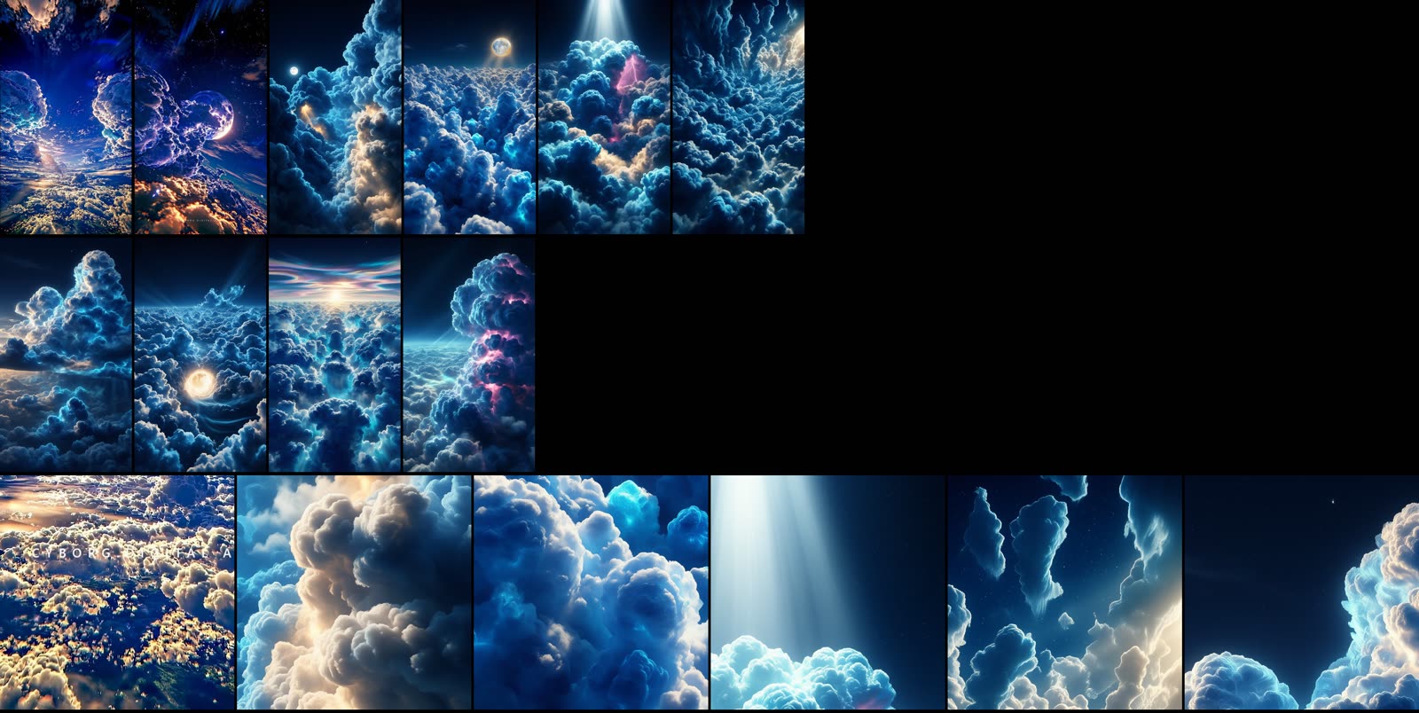
The eight scenes from the table below, generated with the corrected negative prompt.
Across eight scenes generated with the final recipe, every one landed inside or next to the reference band:
| Scene | Sharpness | Shadow | Mid-tone | Highlight (warm) | Contrast |
|---|---|---|---|---|---|
| Cloud canyon | 76 | 0.88 | 0.66 | 0.43 (15%) | 0.78 |
| Cloud sea, moon | 96 | 0.91 | 0.77 | 0.37 (3%) | 0.73 |
| Thunderhead | 74 | 0.93 | 0.69 | 0.37 (11%) | 0.78 |
| Mammatus ceiling | 106 | 0.95 | 0.73 | 0.31 (0%) | 0.65 |
| Anvil, sunset | 65 | 0.85 | 0.65 | 0.35 (10%) | 0.67 |
| Fallstreak hole | 116 | 0.90 | 0.75 | 0.38 (8%) | 0.73 |
| Nacreous | 96 | 0.92 | 0.70 | 0.28 (4%) | 0.68 |
| Tower, lightning | 76 | 0.88 | 0.66 | 0.40 (3%) | 0.75 |
| Reference | 168 | 0.85 | 0.72 | 0.28 (49%) | 0.78 |
What to take from this
A negative prompt is a vector, not a filter. It is easy to read grey, washed out, pale as "please don't produce dull images" — a wish. Under CFG it is arithmetic: the sampler is displaced along the line from that embedding toward the positive one, by a factor you set. Anything in there gets its opposite amplified, whether or not you wanted the opposite everywhere.
Put defects in the negative, never colours. Blur, mush, low detail, artefacts, watermarks, text — these have no useful opposite to overshoot into. Colour, brightness, and saturation words do, and the overshoot lands on the regions you were not thinking about. If you want a colour, ask for it in the positive prompt where you can also say where.
A negative prompt copied from a CFG-1.0 setup is live ammunition. This is how the bug survived three rounds of investigation: the string was written when guidance was off and it genuinely did nothing. Turning guidance on turned an inert string into a strong instruction, and nothing in the interface flags that.
Diagnose the specific band, not the overall look. "Too saturated" is not actionable. "Mid-tones on target, highlights at 0.74 against 0.28" points straight at the mechanism — something is colouring the bright pixels — which is what ruled out the guidance scale in one run.
What this does not show
One model family, one look target, eight scenes. The mechanism — guidance extrapolates away from the negative embedding — is general to classifier-free guidance and should reproduce anywhere it is implemented, but the size of the effect will depend on the model, the CFG value and how strongly the negative words are represented.
The measurements are single-seed per scene. The bands are wide enough (0.74 → 0.40 on highlights) that seed noise does not plausibly explain them, but no repeat-seed variance was measured, so treat the individual numbers as one draw rather than a mean.
Sharpness stayed 76–116 against a reference of 168. Guidance improved detail but did not close that gap, and nothing in this article addresses it.
FAQ
Why does turning CFG down not fix oversaturation?
Because CFG scales how far the sampler moves away from the negative, not which direction. If colour words in the negative are setting the direction, lowering the scale reduces every effect proportionally — including the sharpness you wanted — while the image stays on the same wrong heading. Measured here: CFG 5 → 3 moved highlight saturation from 0.74–0.82 to 0.71–0.76.
What belongs in a negative prompt?
Failure modes with no desirable opposite: blurry, soft focus, low detail, mushy, posterized, text, watermark, extra limbs. You can also negate the failure you are actually seeing — adding oversaturated, neon was part of the fix here.
Should I use a negative prompt at all with a distilled model?
It does nothing at CFG 1.0, which is where most distilled fast models run. That is harmless until you switch to a guided model and carry the string over, at which point it becomes a strong instruction that was written under the assumption it would be ignored.
Why measure mid-tones separately?
Because shadows and highlights are dominated by the tone curve and clip on their own, so an overall saturation average mostly reports exposure. The mid-tone band is where the model's actual colour decision lives, and it was the band that a distilled model refused to move (0.32–0.42) and guidance moved instantly (0.80).
Is a saturation curve in post a valid substitute?
Partly. Applying a curve only inside the 0.25–0.8 value window raised mid-tones from 0.35–0.46 to 0.44–0.56 without wrecking the highlights, which is a real improvement. But it redistributes colour that is already in the image rather than generating it, and it cannot recover the detail that guidance also brought. Fix it in generation if the model supports guidance.
← Back to all posts